

Command center presentation
You can log into the tool via your browser. It supports Google Chrome and Microsoft Edge. This is important because some functionalities may be unavailable or work incorrectly if you decide to use other browsers.
After logging in, we arrive at the Home screen – our command center. The most important part is located in the middle of the screen: this space can be freely customized by the user to fit their needs. And the range of personalization options is enormous.

By default, the area consists of several tiles:
- a tile with shortcuts to the most common actions such as creating a new account, creating a new report, or using the tool’s help center;
- a tile with recently viewed reports – it is very useful because the user can go to the reports they are interested in immediately after logging in instead of having to search for them in folders;
- visualization tiles that can be pinned to the Home screen by the user.
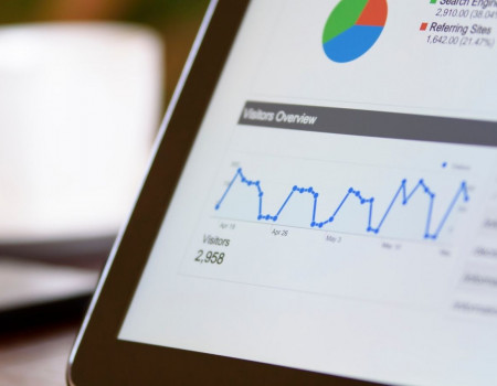
Visualizations are the most analytically significant charts from previously created reports. From a visualization we can go straight to the report from which it originates – thus checking its whole analytical context with one click.
Additionally, as SAP operates in real time, the data changes on the fly, and changes are visible right away in the pinned indicators.
Quick start
The top right corner of the Home screen features several functionalities that are very useful to users – especially those who are just starting to work with SAP Analytics Cloud. Clicking on the question mark icon reveals a guide to working with the tool, user manuals in the form of a Help Library of topics, and helpful video tutorials.

The knowledge base is very rich, and the community participating in its creation is extensive and happy to share their knowledge. Therefore, the possibilities of learning while using the tool are practically unlimited.
Notifications and updates
SAP Analytics Cloud is a tool which continues to be intensively developed by the producer. Bug fix updates and new functionalities are introduced every two weeks. To help users keep track of them, SAP provides information about new developments in several places on the website.
- Under the “What’s New” tab:

- On the bar at the top of the page:

The notifications icon is also important. Here we can find all the important notifications about new data uploads, starting discussions between colleagues, system updates, the creation of new models or reports, etc.

Creating data models and visualizations
The most important icon from the perspective of a creator of data models and visualizations is located in the upper left corner of the Home screen. Here we can access the analytic tools for building reports. We can also find information about the system, create links to data sources, and manage user privileges or the task calendar.

In the next article, I will discuss the functionalities mentioned above, i.e., creating models, visualizations, and tables.